State an Interesting Fact About the Growing Population
Make a simple poster or bar graph showing population growth over time, then state one interesting fact and explain why it matters.


Step-by-step guide to make a poster or bar graph showing population growth and state one interesting fact
World Population Growth Evolution - 10,000 BC to 2025
Step 1
Pick a place to study like your town your country or the whole world.
Step 2
Choose four years to compare for example 1900 1950 2000 and 2020.
Step 3
Ask an adult to help find the population numbers for those years or choose simple numbers to practice.
Step 4
Gather your materials on a clean flat table so everything is ready.
Step 5
Use the pencil and ruler to draw a large L shaped graph with a horizontal axis for years and a vertical axis for population.
Step 6
Write each chosen year evenly spaced along the horizontal axis using the ruler to keep them straight.
Step 7
Decide a scale for the vertical axis for example each grid line equals one million people and mark equal numbered intervals up the axis.
Step 8
Use the ruler to draw a bar for each year with the bar height matching the population number using your chosen scale.
Step 9
Colour each bar with a different colour so each year stands out.
Step 10
Stick a sticky note or write the exact population number above each bar so the amounts are clear.
Step 11
Write a short title at the top that explains what your poster shows like Populations Over Time.
Step 12
State one interesting fact about the growth in one clear sentence on the poster.
Step 13
Write one sentence below your fact that explains why that fact matters for people or the planet.
Step 14
Add a small fun decoration or border to make your poster look great.
Step 15
Share a photo or description of your finished poster and your interesting fact on DIY.org
Help!?
What can we use if we don't have a ruler, sticky notes, or coloured pencils?
If you don't have a ruler, use the straight edge of a book or folded cardboard to draw the L-shaped graph and measure bars, write the exact population numbers directly above each bar instead of sticky notes, and colour the bars with crayons, markers, or glued coloured paper.
My bars don't match the population numbers — how can I fix them?
If bar heights are wrong, erase and redraw the vertical axis with a clear scale like 'each grid line = 1 million', mark equal intervals with your straight edge, then use the ruler to measure each bar height from zero to the correct interval before colouring and placing the number label.
How can I adapt this activity for different age groups?
For younger children, limit to two years or use simple round numbers and pre-drawn axes to colour in, while older kids can use real census data for more than four years, calculate percent growth, and write a more detailed explanation sentence about why the change matters.
What are some ways to extend or personalise the poster after finishing the basic bars?
To enhance the poster, add a second colour-coded set of bars for another place to compare, glue small person-shaped stickers proportional to the population for a visual key, decorate the border to match your title, and include one sentence about causes so you can share a richer photo on DIY.org.
Watch videos on how to make a poster or bar graph showing population growth and state one interesting fact
World Population - History & Projection (10,000 BC-2100)
4 Videos
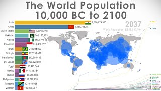
World Population - History & Projection (10,000 BC-2100)
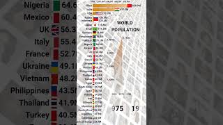
World Population Growth Visualised
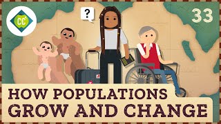
How Populations Grow and Change: Crash Course Geography #33
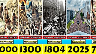
The Growth of Humanity: World Population Timeline
Facts about population growth and demographics
🌍 The world population reached about 8 billion in November 2022.
⏳ It took until around 1804 to reach 1 billion people, but only about 218 years to go from 1 billion to 8 billion — showing how fast growth sped up.
🏙️ More than half of the world’s people now live in cities, which changes where we need homes, schools, and parks.
👶 Global fertility rates have dropped since the 1960s, so overall population growth is slowing and many countries are aging.
📊 Governments and the UN use censuses and yearly estimates — perfect data to turn into a clear poster or bar graph.
How do I help my child make a simple poster or bar graph showing population growth over time and explain why one fact matters?
What materials do I need to make a population-growth poster or bar graph with my child?
What ages is this population-growth poster activity suitable for?
What are the benefits of having my child create a population-growth poster and state one interesting fact?
